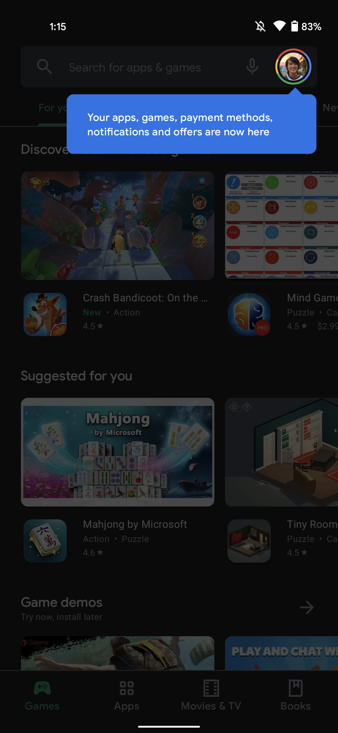
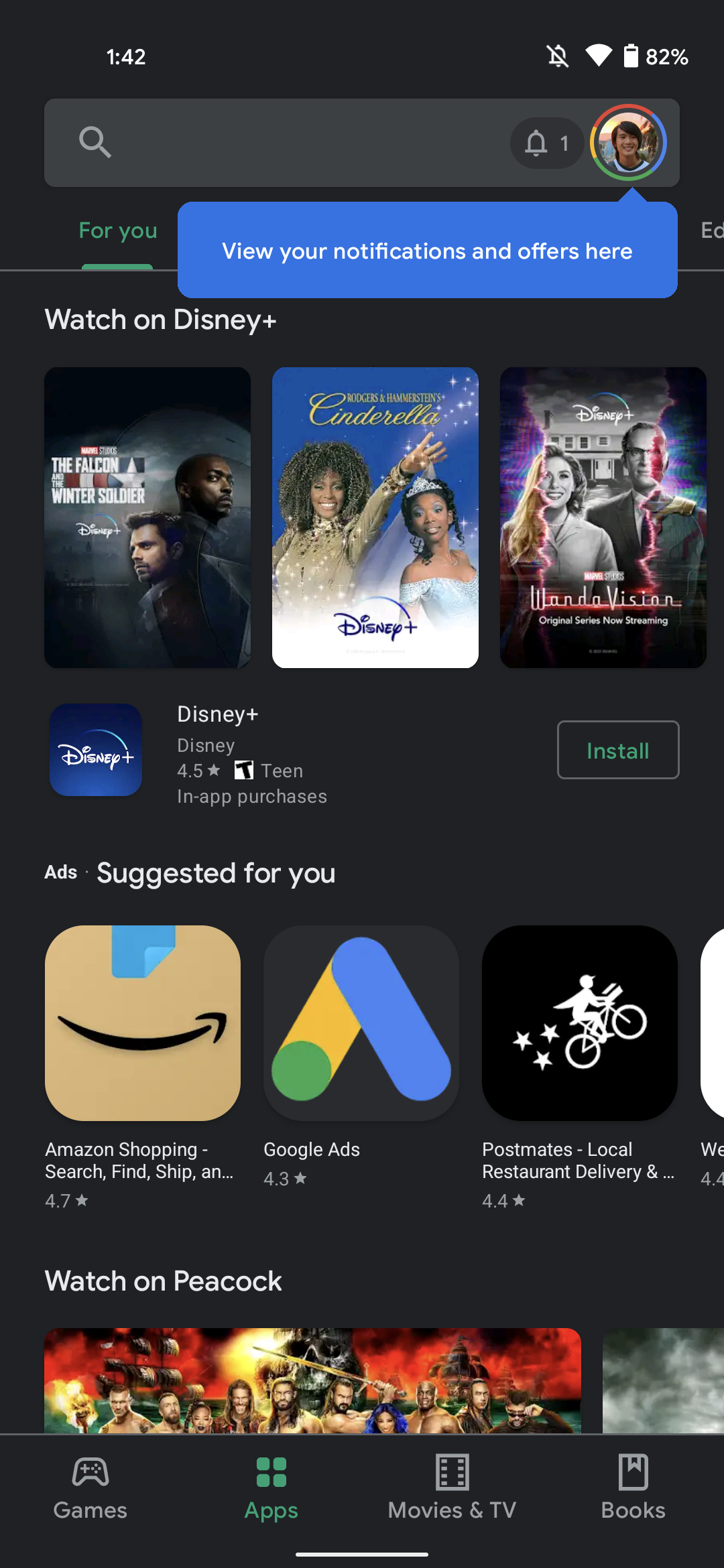
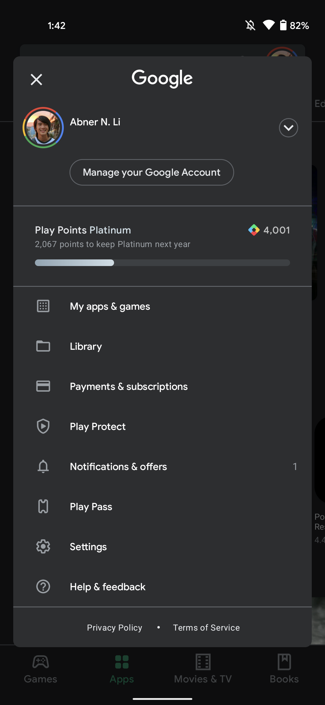
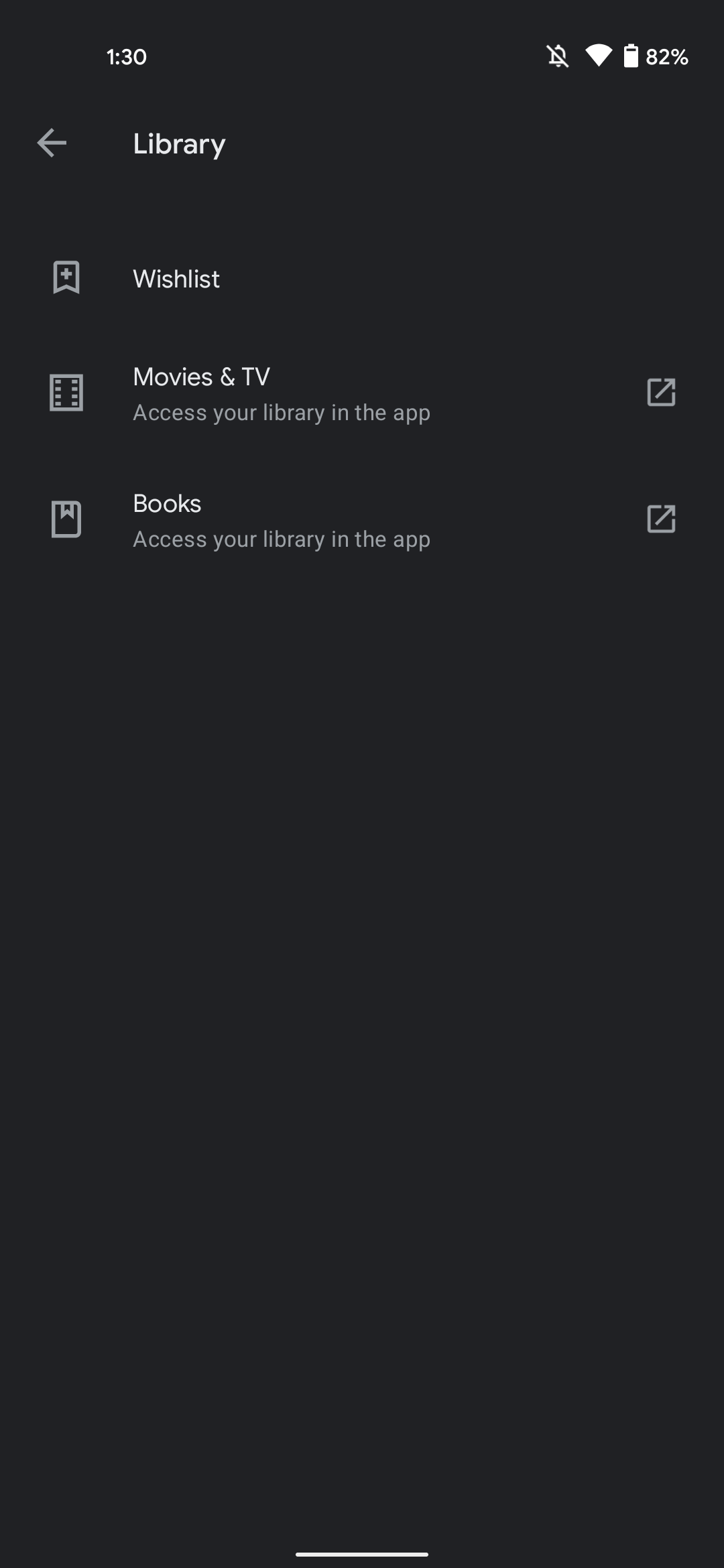
In the new update, users will be able to see a blue overlay that will appear at the top right corner, highlighting the profile avatar. The account is placed at the top and is hidden. It will show up once you tap it. The “My apps & games” page is not changed however changes are made in the “Library” and links to Wishlist, Google TV/Play Movies & TV, and Play Books. “Payments & subscriptions” are kept together on one page just beside the “Play Protect”. “Notifications & offers,” as well as “Play Pass,” are kept down the other navigation drawers and Settings, Help & feedback round out the list. This new navigation setting gives us a clear idea that Google is slowly phasing out navigation drawers on Android. Below are the images that showcase the revamp app: Furthermore, the Settings menu is revamped as well. It is quite a long list but confined to the four main sections including General that deals with an account,auto-update preferences. The other one is Use Controls having fingerprint, purchase authentication and Family having Parental control land, parent guide. The last one is About the tab that carries Play Store, build version, device certification Also Read: How to Fix Google Play Store ‘Download Pending’ Error? 8 Easy Methods


